Nocturnal Book Reviews 3rd Blogoversary Celebration Day Three with Susan Illene!
Hello, peeps!
We
are THREE on the 9th of May, so we will be celebrating all week with
exclusive content from our favorite authors, giveaways and personal
tidbits.
Hope you join us in all the fun.
Cheers,
Karina & Vika
Did you know?
Crossed by J.F. Lewis was the first review on the blog, and I gave it 9/10.
Misfit by Jon Skovron was my first advance reader copy, and I gave it 9.5/10.
At last, my first giveaway happened to be Magic Slays by Ilona Andrews :)
I received my first comment from Lauren Chase, and my second from Melissa who is still one of my dearest blogger friends! *mwah*
Today's guest of honor is an urban fantasy author who found our blog last year and who fast became our friend. Susan Illene will talk about the making of a book cover and what is actually involved into it when it's done by a team of professionals.
* * *
Designing A Professional Book Cover
We all get to
see the end result of book covers, but how does an author/publisher
put together a professionally designed one? Today I’m going to go
over how I put together the cover for my latest novel, Darkness
Divides.
I had to coordinate
with my photographer, Teresa Yeh, and designer, Claudia McKinney.
We were actually going to be doing a series of shots to get poses
for Darkness Divides
plus several other series covers and some promo photos. She
conducted a casting call to narrow down the potential female models
who could fit the look of my main character.
During this time I
also contacted several of my more avid fans from Facebook to help in
the planning. This helped ensure I’d end up with cover designs
that would appeal to most readers (though you can never please
everyone). They all readily accepted and were totally motivated to
jump into the project (and sworn to secrecy). When the shortlist of
models from the casting call came in, they helped me choose the best
one.
Next we worked out
wardrobes and props (weapons, gloves, jewelry, etc). We were
re-doing the first cover in the series as well as planning shots for
the third, fourth, and fifth books. On top of that we had to work
on promo shots that would include the male model from my novella,
Chained by Darkness,
who represents my main character’s love interest.
Wardrobes
were probably the hardest part because it’s tough getting four
women (including myself) to agree on anything. Luckily, I had a
great group and they helped me find just the right clothes to
purchase and send for the shoot. Below is a pic at the
photographer’s studio that shows the layout for some of the outfits
and props used:
We also had to
discuss hair. The model, Haley, had the right height, face, and
natural expressions but she didn’t have the right color hair. My
main character, Melena, has dark auburn and Haley has black. That
meant using a wig, which limited hair styles, but we came up with
some that we felt would look good for the covers. Below are some
shots (there were two shoots to get everything we needed and these
are from both) that show the hair/make-up artist, Nadya Rutman,
getting the model ready. I was very pleased with Nadya’s work.
The below one
has them getting her natural hair stuffed under the wig.
There was one
unfortunate set of circumstances for the first photo shoot that
caused a delay in the Airsoft guns I’d purchased from arriving in
time. The shoot took place in the Boston area back in February
during a series of snowstorms. My package with the weapons got
stuck on a truck for several days and there was no amount of begging
UPS that could get it delivered when we needed it.
Thankfully
the husband of the make-up/hair stylist, Carl Rutman, offered to loan
us some from his collection. They weren’t the exact same models as
what my character uses in the books, but at least they were real
ones, which added some authenticity. This is a better shot of him
helping with Haley’s hair. Such an awesome guy for all his support
to this project!
We also had to plan
the pose and theme to use for each cover so the photographer had a
direction to guide the model during the shoot. There was a lot of
back and forth emails with my planning team discussing different
looks we found from various movie promos, tv promos, and other book
covers. Two of the main ones we thought fit what we wanted were fan
art for Tomb Raider
and some stills of Maggie from the show Falling
Skies. Here’s a shot of Maggie below:
The photo shoot
produced numerous shots that looked great, but my team and I managed
to narrow it down to the best one (sorry, can’t post the raw
photos). Then we had to select the best background to go with it.
Since this series takes place primarily in Alaska, we wanted the
Darkness Divides
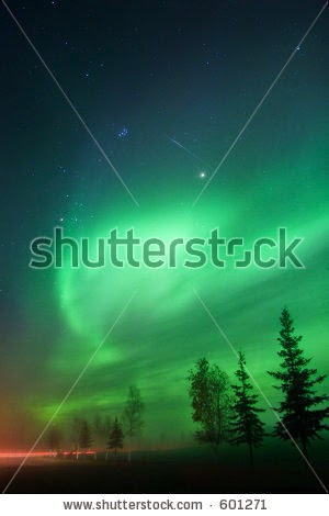
cover to really show that. Through stock sites we found a nice shot
near Fairbanks (the place my character currently lives) that worked
well. I legally purchased the rights to use it for my cover, but
for the purpose of this post I’ve left the watermark so it’s
attributed to its source.
The above shot had
one problem. I didn’t think the green northern lights worked well
with the model shot. As a series theme, all my main novels have the
lights in the background, but these didn’t work well for the
overall look I wanted. My cover designer, Claudia, got permission
to use a National Geographic photographer’s shot of some other
northern lights (a friend of hers), which is what you see on the
final cover. They give a more fiery look, which was a great way to
represent the initial explosion that rocks the region at the
beginning of the novel.
And here is
the end result:
As a
bonus I’m including a few of the promo poses that came from the
photo shoots as well. Since this is an urban fantasy series I can’t
get away with putting shots like these on the covers without
misleading readers, but I did want to get them done for fans to enjoy
and share.
A
couple of the above shots were used in the Darkness
Divides video trailer (without the quotes),
along with a couple I didn’t post here. You can see it below:
I
do have the exclusive rights for use of all the model shots, so no
worries about seeing them on any other books or material. There are
more shots from the photo shoot waiting until the next novels in the
series release, but I hope you enjoyed seeing these. Thanks so much
for checking out my guest post and thanks to Karina for inviting me
to share!
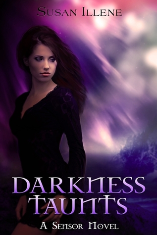
Also, for the giveaway I'd be happy to offer the paperback versions of
Darkness Haunts, Darkness Taunts, and Chained by Darkness (Darkness
Divides doesn't have a hard copy yet). I'll also include a set of
series bookmarks, a Darkness Taunts notebook, and a tote bag.
* * *
Thanks so much, Susan, for such an informative thorough post! I always wondered about the process of making the book cover and you satisfied my (and hopefully our readers) curiousity :)
Folks, just comment on this post to get entered into the contest. I'll close it on May 11th and choose a winner with the help of Random.org.
Good luck!
Here is our reviews of Darkness Haunts | Darkness Taunts | Chained by Darkness
I am reading Darkness Divides right now and it's very good. I just love Melena's down-to-earth levelheadedness! :)


.jpg)


